
I have been testing Adsense Ad placement for the last 5 years on the Candytech.in (Blog) and have earned a lot of experience. In this article, I will share with you the best practices that we use to get the best revenue from Adsense on desktop.
Also, I strongly consider the UI/UX before doing Ad placements. After all, we don’t want to annoy our readers.
For all the placements that I have discussed in this article – you can use the free WordPress plugin ad-inserter to place the ads. It is as simple as starting a blog.
Using Auto Ads On Desktop
We tested the Auto Ads on the desktop but the Ad placements at times can break the user experience. Some of the Ad sizes are either too big or placed at the locations which are not ideal from a reader’s perspective.
I will not recommend using Auto Ads placement for your website. Auto Ads are good for those who don’t want to spend the time to optimize the Ads. Since you are here I assume that you want to put in the extra effort to get the best out of your traffic.
Above the fold Placement and Sizes
Let’s start with the Above the fold placement. Typically, the Above the fold Ads get higher RPM and earn more revenue per click. But these may not have the highest CTR.
Above the fold – you can use a 768*90 Ad unit or can even use a bigger 970*250 ad unit. In our experience, the revenue from the 970*250 Ad is about 14% higher than the 768*90 ad unit, based on 7 days of testing.
However, the 970*250 is a big ad unit and looks bad from the user experience perspective. Also, bigger Ad units can make the website sluggish and slow loading due to the higher amount of code(Js, images, HTML, and videos).

I usually use the 768*90 ad unit at the top or you can use a responsive ad and set the size for desktop as 768*90. You can even try the 970*90 Ad size and see if it helps to improve the CTR.
Sidebar Ad Placement and Sizes
For side-bar it is ideal to have a 300*600 Ad unit which is placed parallel to where your article starts. It will give the ad unit much higher visibility and CTR.
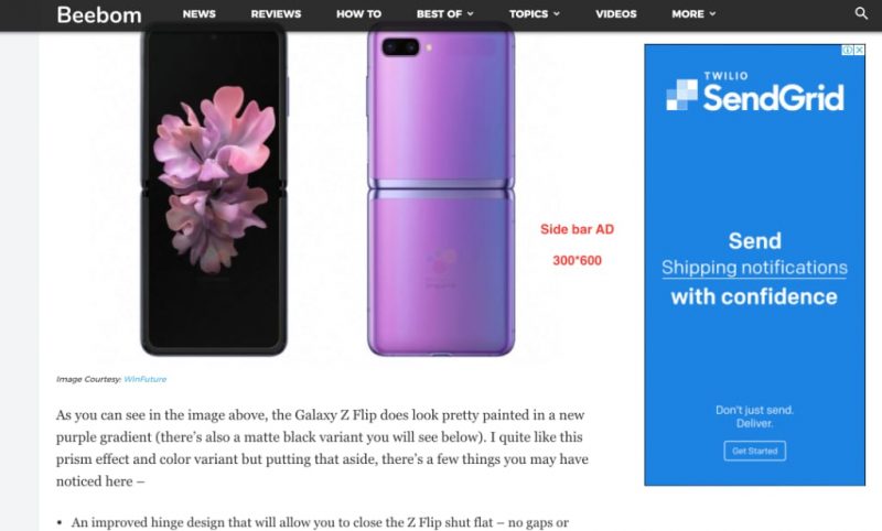
If you want to add a second unit, you can add it after some content on the side-bar. Don’t have two ads together, not ideal for the UX.
Essentially, you should use a 300*250 Ad or 336*280 Ad as a second ad unit. The bottom ad unit usually has a very low CTR and revenue so for my websites I usually don’t use it.
In-Content Ads
These are the most important Ads and we can use either square floating ads on the left or right of the content or we can use a full-width responsive ad.
Typically, I prefer to use full-width responsive ads as it doesn’t break the layout and is not so annoying for the reader.
The first ad can be placed before paragraph 1, and the second ad can be placed after paragraphs 7-8.
You can even use a matched content ad to reduce the bounce rate on your website and increase the page views and revenue.
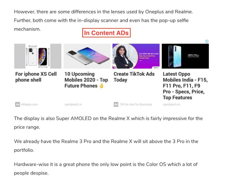
Typically, you should use the responsive Ad in this position with a “horizontal” Ad format. A rectangle or a large square may not look nice to the reader.
We must ensure that the experience for the reader is not annoying so he is easily able to read the content.
Next, you can place an ad after paragraph 15 then 30, 45, 60 and so on. Ad-inserter plugin can make this task very easy for you.
If you are using the responsive Ad unit, another nifty trick is to use the “rectangle” ad code for ads you are placing in the middle of your content or at the bottom. The rectangle ads offer better CTR and can increase your revenue.
Read – How to Customize the Responsive Ads.
The last Ad can be placed below the content, but you must take care of pagination. It is ideal to have the Ad below the pagination navigation.
We saw an increased bounce rate on one of the sites where the bottom ad was right above the pagination.
Footer Ads
You can try a large 970*250 or 970*90 in the footer, but in my experience, there are low clicks and very little revenue from this placement.
Sticky Ads on Desktop
If you have seen websites using sticky sidebar ads, they are not Adsense Ads. These ad units are from Adx and publishers can use them with sticky placement. Adsense doesn’t allow sticky ad units on either desktop or mobile.
It is not advisable to use the sticky Adsense Ad unit as its Adsense team may ban your account or give a warning. (Read the latest discussion on the Sticky Ads.)
Less Can be More
One of the most ignored optimization principal is fewer Ads can mean more revenue. In fact, Google in its official optimization guide states this.
Don’t try to use more than 3-4 units unless you have a very long article. It is best to have ads on the top 50% of your article and one Ad at the bottom.
Most of the readers quit the website halfway and some who reach the bottom are then looking for what to click. I have done several studies using a scroll map and heat map and found that it is best to have ads in the top half of your article.
Thanks for Reading the Adsense Optimization guide for Desktop. If you have any queries or need help, drop a comment, I usually answer within 24 hours.
Also, Read:
Learn How to Do Email Marketing the Right Way – Comprehensive Guide